

Atomic Design with React
Introduction
In the dynamic world of web development, the quest for efficiency, reusability, and clarity in code structure is unending. Enter Atomic Design - a methodology that’s been a game-changer for many, especially when combined with the powerful React library. In this post, we’ll dive into the nuts and bolts of Atomic Design, explore its integration with React, and uncover how this powerful duo can streamline your development process, making your code not just a bunch of lines but a well-organized, scalable masterpiece. So, whether you’re looking to refine your skillset or searching for that next leap in your project’s architecture, you’re in the right place. Let’s embark on this journey of structure and efficiency together.
Understanding Atomic Design
Atomic Design is not just a concept; it’s a methodology, a mindset that breaks down interfaces into fundamental building blocks. The idea, popularized by Brad Frost, takes inspiration from chemistry. Just like everything in the universe is made up of a combination of atoms, Atomic Design suggests that every interface is a combination of smaller, independent components.
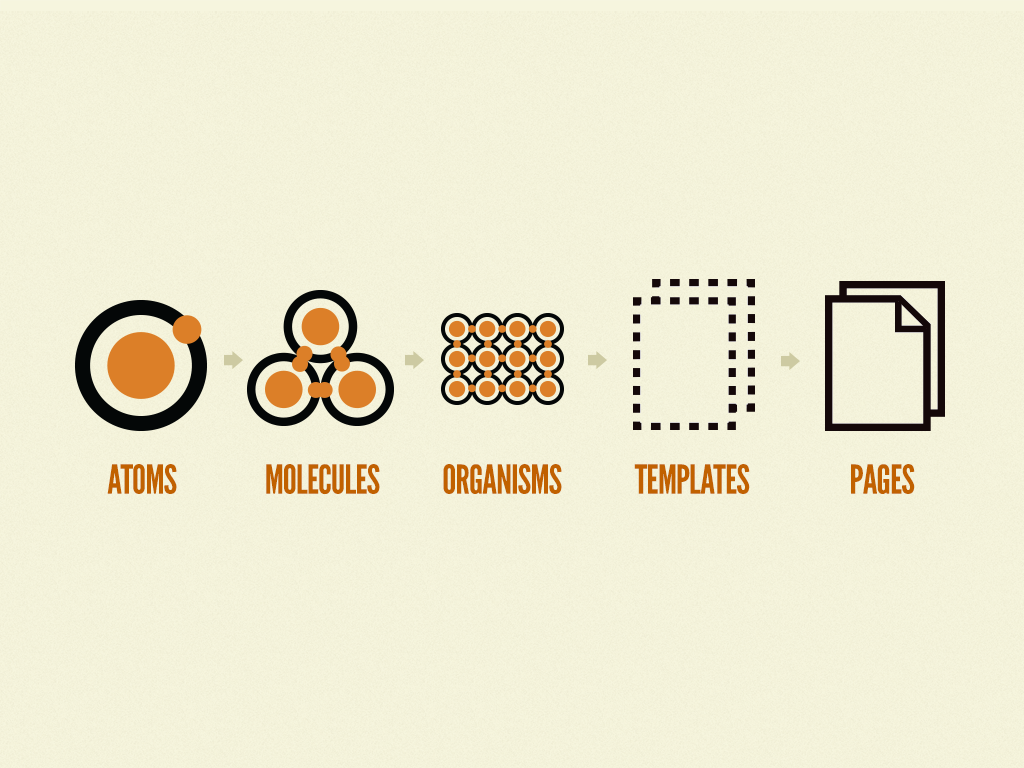
Atoms
Atoms are the smallest possible components, think of them as the HTML tags like a button, input or a form label. They are the foundation, the building blocks that can be used across the application. For instance, a button might have different states - disabled, hover, or different sizes, but at its core, it’s still an atom.
Molecules
Molecules are slightly more complex. They combine atoms to form a functional unit that can take on its own properties and functions. For example, a search box molecule might consist of a label atom, input atom, and button atom working together as a unit.
Organisms
Organisms take this concept a step further by combining multiple molecules and possibly atoms to form distinct sections of an interface. Think of a header organism that might consist of a logo atom, navigation molecule, and search box molecule.
Templates
Templates are not about actual instances but more about the underlying content structure. They lay out the design by positioning organisms and molecules in a layout but without real content, sort of like a wireframe.
Pages
Finally, pages are where everything comes to life. This is where actual content is applied to templates and where we test the design’s effectiveness. Pages are what the users ultimately interact with.
Atomic Design in React
React’s component-based architecture aligns beautifully with Atomic Design. It encourages the development of reusable components, making it a perfect match for this methodology. In React, we can encapsulate atoms, molecules, and organisms into components, manage their states and props, and compose them to form complex UIs.
But it’s not just about building components; it’s about building them right. Atomic Design in React pushes us to think about components’ reusability, testability, and maintainability, ensuring that each component serves a purpose and fits perfectly in the grand scheme of the interface.
Implementing Atomic Design in React
Implementing Atomic Design in React requires a systematic approach to component creation and organization. The goal is to build a structured, maintainable, and scalable codebase. Let’s break down the steps:
Step 1: Setting Up the Project Structure
Before we start coding, it’s essential to set up a clear and consistent folder structure. This structure will reflect the Atomic Design hierarchy and make it easier for developers to find and manage components. Here’s a recommended folder structure:
src/
│
├── components/
│   ├── atoms/
│   │   ├── Button/
│   │   │   ├── Button.tsx
│   │   │   ├── Button.module.css
│   │   │   └── index.ts
│   │   ├── Input/
│   │   │   ├── Input.tsx
│   │   │   ├── Input.module.css
│   │   │   └── index.ts
│   │   └── ...
│   │
│   ├── molecules/
│   │   ├── SearchBox/
│   │   │   ├── SearchBox.tsx
│   │   │   ├── SearchBox.module.css
│   │   │   └── index.ts
│   │   └── ...
│   │
│   ├── organisms/
│   │   ├── Header/
│   │   │   ├── Header.tsx
│   │   │   ├── Header.module.css
│   │   │   └── index.ts
│   │   └── ...
│   │
│   ├── templates/
│   │   └── ...
│   │
│   └── pages/
│       └── ...
│
└── ...
In this structure:
- Each component (atom, molecule, organism) has its own folder.
- The folder contains the component’s TS file, CSS file, and an
index.tsfor clean imports. - Templates and pages also follow a similar structure, ensuring consistency across the project.
Step 2: Creating Atoms
Atoms are the simplest components, like buttons, inputs, or icons. They are used throughout your application and should be versatile and reusable.
Here’s an example of a simple Button atom:
Button.tsx
import React from 'react';
import styles from './Button.module.css';

interface ButtonProps {
  children: React.ReactNode;
  onClick: () => void;
}

const Button: React.FC<ButtonProps> = ({ children, onClick }) => (
  <button className={styles.button} onClick={onClick}>
    {children}
  </button>
);

export default Button;
Button.module.css
.button {
  padding: 10px 20px;
  border-radius: 5px;
  cursor: pointer;
  font-size: 16px;
}
index.ts
import Button from './Button';
export default Button;
Step 3: Crafting Molecules
Molecules are groups of atoms bonded together. They serve as the backbone of your UI by combining atoms to form more complex UI components.
Here’s how you might create a SearchBox molecule:
SearchBox.tsx
import React, { useState } from 'react';
import Button from '../atoms/Button';
import Input from '../atoms/Input';
import styles from './SearchBox.module.css';

interface SearchBoxProps {
  onSearch: (value: string) => void;
}

const SearchBox: React.FC<SearchBoxProps> = ({ onSearch }) => {
  const [value, setValue] = useState('');

  const handleSearch = () => {
    onSearch(value);
    setValue('');
  };

  return (
    <div className={styles.searchBox}>
      <Input value={value} onChange={(e) => setValue(e.target.value)} />
      <Button onClick={handleSearch}>Search</Button>
    </div>
  );
};

export default SearchBox;
SearchBox.module.css
.searchBox {
  display: flex;
  align-items: center;
}
index.ts
import SearchBox from './SearchBox';
export default SearchBox;
Step 4: Assembling Organisms
Organisms are groups of molecules joined together to form a relatively complex, distinct section of an interface.
Let’s create a Header organism:
Header.tsx
import React from 'react';
import SearchBox from '../molecules/SearchBox';
import styles from './Header.module.css';

interface HeaderProps {
  onSearch: (value: string) => void;
}

const Header: React.FC<HeaderProps> = ({ onSearch }) => (
  <header className={styles.header}>
    <h1>My App</h1>
    <SearchBox onSearch={onSearch} />
  </header>
);

export default Header;
Header.module.css
.header {
  display: flex;
  justify-content: space-between;
  align-items: center;
  padding: 20px;
  background-color: #f8f8f8;
}
index.ts
import Header from './Header';
export default Header;
Step 5: Composing Templates and Pages
After assembling our atoms, molecules, and organisms, we’re now ready to construct our templates and pages. This is where the Atomic Design methodology really comes to life, bringing together the smaller components to form complete interfaces.
Templates
Templates are like the skeleton of a webpage. They lay out the structure without the actual content, defining how components interact spatially but not what they contain.
Here’s a basic example of a MainTemplate:
MainTemplate.tsx
import React from 'react';
import Header from '../organisms/Header';
import './MainTemplate.module.css';

interface MainTemplateProps {
  children: React.ReactNode;
}

const MainTemplate: React.FC<MainTemplateProps> = ({ children }) => (
  <div>
    <Header onSearch={(value) => console.log(value)} />
    <main>{children}</main>
  </div>
);

export default MainTemplate;
MainTemplate.module.css
main {
  padding: 20px;
}
index.ts
import MainTemplate from './MainTemplate';
export default MainTemplate;
The MainTemplate here lays out the page structure, including the Header and the main content area where different pages can render their unique content.
Pages
Pages are instances of templates with real content. This is where we connect our components to the actual data and functionalities of the app.
Let’s create a HomePage:
HomePage.tsx
import React from 'react';
import MainTemplate from '../templates/MainTemplate';
import './HomePage.module.css';

const HomePage: React.FC = () => (
  <MainTemplate>
    {/* Content specific to the HomePage */}
    <h2>Welcome to My App</h2>
    {/* Other components or content can go here */}
  </MainTemplate>
);

export default HomePage;
The HomePage is a concrete instance of the MainTemplate, filled with its own content and components. It’s where the user interacts with the app, seeing the actual data and using the functionalities provided.
Real-World Example
Imagine we’re working on a large-scale enterprise application, a project management tool that needs a highly scalable and maintainable UI. This tool requires various UI components: buttons, modals, forms, dashboards, and complex page layouts. Implementing Atomic Design in this React project, we structured our components into atoms, molecules, organisms, templates, and pages.
Challenges:
- Managing a large number of UI components.
- Ensuring consistency across the application.
- Making the UI components easily maintainable and scalable.
How Atomic Design Helped:
- Scalability: By breaking down the UI into fundamental building blocks (atoms), we could easily scale our application by composing and reusing these atoms.
- Maintainability: Each component was isolated with its own logic and styling, making it easier to manage and update.
- Consistency: The design system enforced consistency across the application, as the same atoms were used to build more complex structures.
Outcome: The development team was able to collaborate more effectively. Front-end developers could quickly construct pages using existing atoms and molecules. Designers could ensure consistency because the atoms closely followed the design specifications. The result was a highly scalable and maintainable codebase, with a consistent look and feel across the entire application.
Conclusion
In conclusion, Atomic Design presents a powerful methodology for building scalable and maintainable web applications, especially when combined with React. By structuring our UI into atoms, molecules, organisms, templates, and pages, we create a clear, logical hierarchy that promotes reusability and consistency.
This approach not only streamlines the development process but also facilitates better collaboration between designers and developers. It ensures that our applications remain scalable and maintainable, even as they grow in complexity.
Happy coding